When teams are working on initiatives, it can be difficult to align on what it takes to deliver value. This is where the Effort vs. Impact mapping exercise comes in handy. It helps teams visualize the effort required to deliver a feature or initiative against the value it will bring to the organization.
What is Effort vs. Impact mapping?
Effort vs. Impact mapping is a visual exercise that helps teams prioritize initiatives based on the effort required to deliver them and the impact they will have on the organization. The goal is to align teams on what it takes to deliver value and to make informed decisions about where to focus their efforts.
How to run an Effort vs. Impact mapping exercise
Perquisites are that you have a list of initiatives or features that you want to prioritize, the team should be somewhat familiar with the initiatives.
Set up a graph with a x-axis that represents effort and a y-axis represents impact. The graph can be divided in to four quadrants.
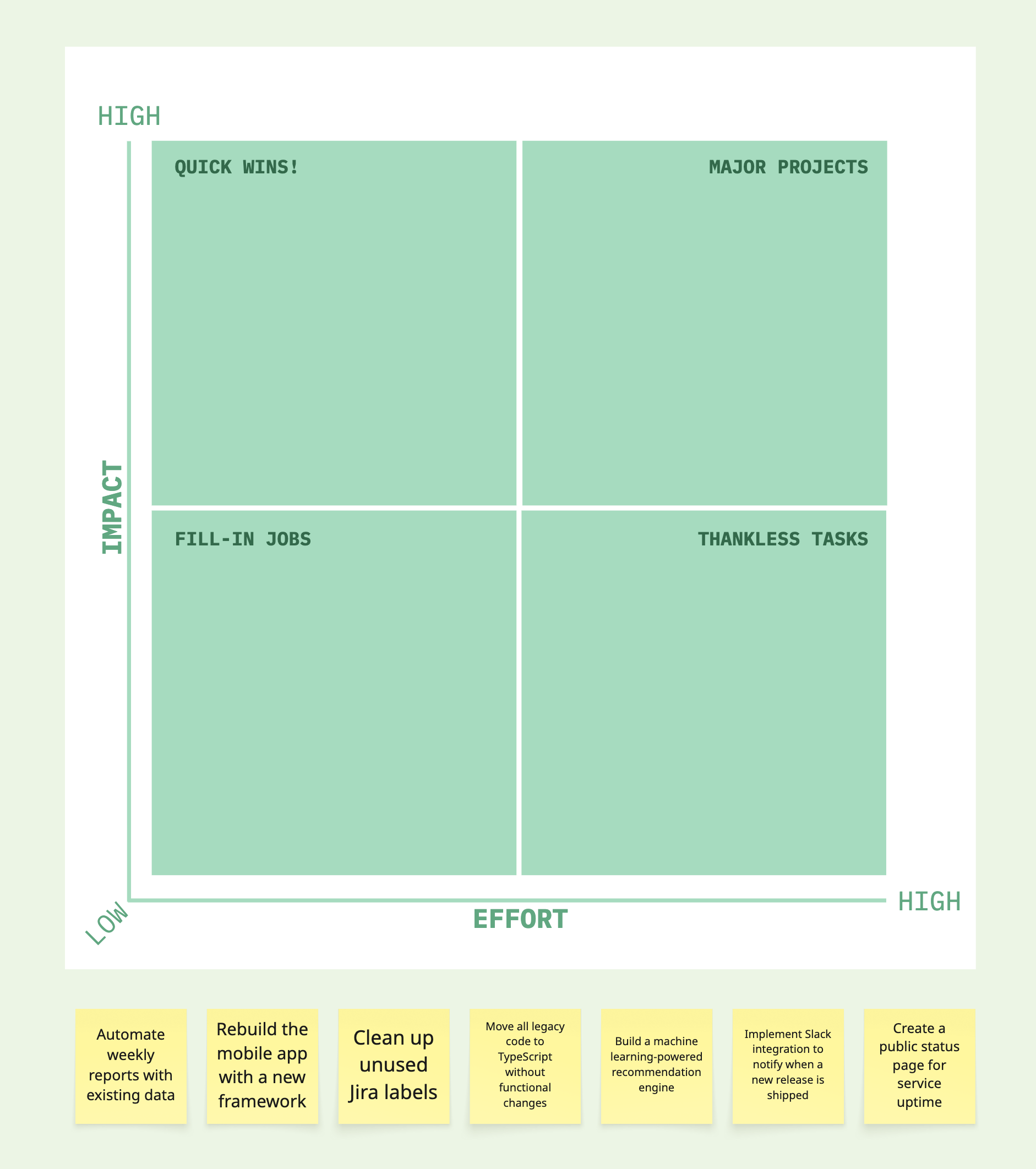
Each quadrant represents a different category of initiatives.
- Low impact, low effort: do them when time allows.
- Low impact, high effort: probably not worth doing, avoid them or deprioritized.
- High impact, low effort: quick win and should be prioritized if possible.
- High impact, high effort: important but may take longer to deliver.
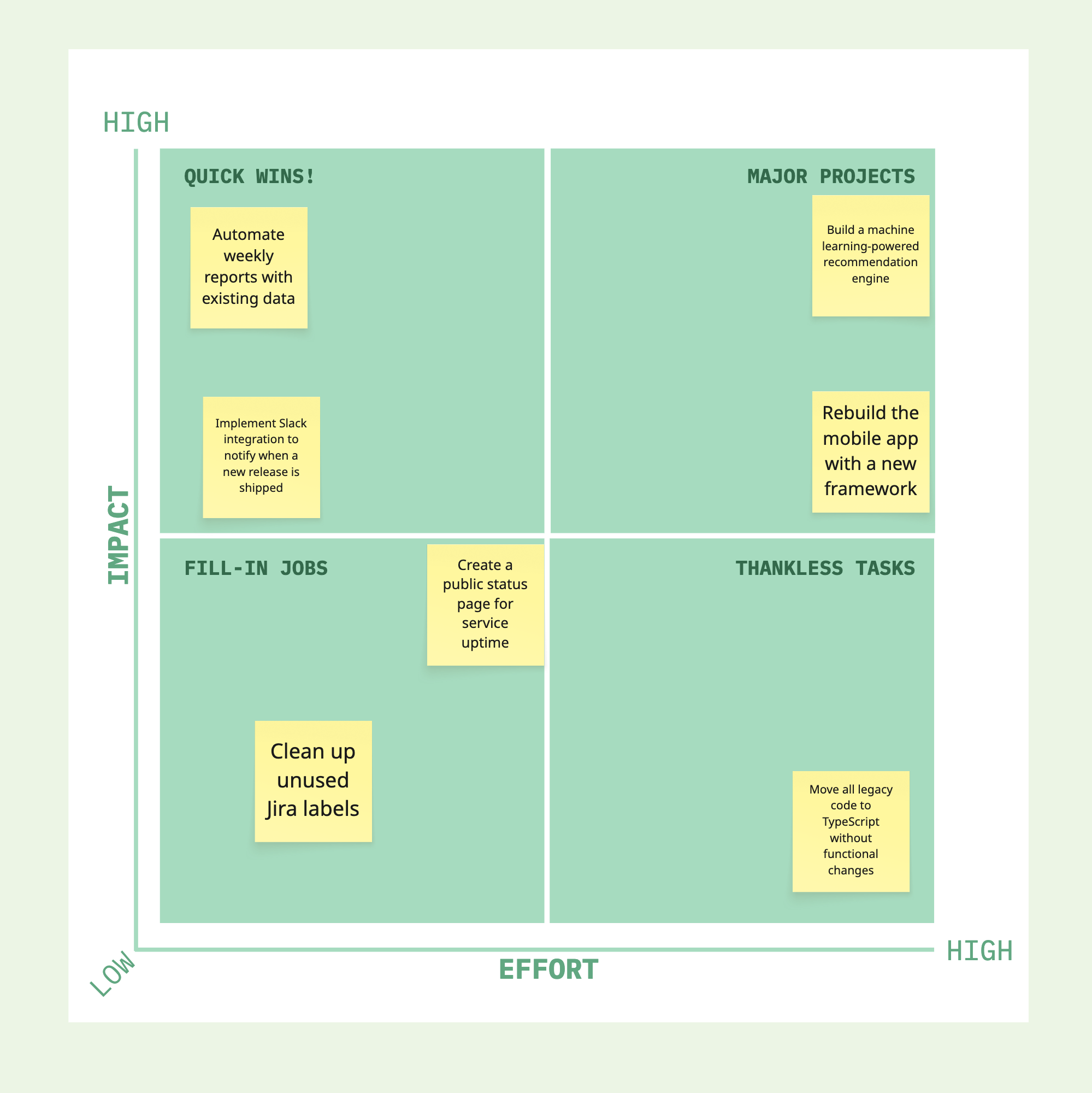
Take each initiative one at a time and have team members place it on the graph based on their perception of its effort and impact. Once placed, open up the floor for discussion. This part is often where the real value happens—explaining why something was placed in a certain spot often leads to knowledge sharing and a deeper shared understanding.
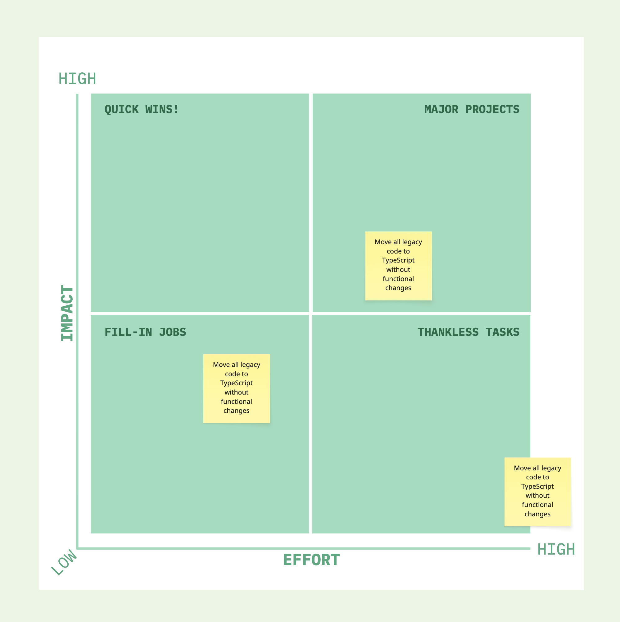
For instance, someone might initially place the initiative "Move all legacy code to TypeScript without functional changes" in the "high impact, high effort" quadrant, believing it's a valuable modernization effort. During the discussion, another team member may point out that the system is scheduled to be rewritten in another language, which significantly reduces the long-term value of this initiative. With that insight, the team might agree to move it to the "low impact, high effort" quadrant.
The first few placements might take a bit of time. The team may also want to move initiatives around as new ones are added to better reflect their relative priority. That's totally normal. As the team gets more comfortable with the format and the content, the process will speed up.
Once all initiatives are placed, review the map together. Discuss any areas of disagreement and make sure everything feels aligned relative to the other items on the graph.
It's also a good idea to revisit the map regularly. As things evolve, so might your assessment of effort and impact. Keeping the map updated ensures the team stays focused on delivering the most meaningful outcomes.